Case study Events · Mobile bar hire
Copper Box
Events.
Logo reconstruction, business card and website, designed and built by Web-Smart.Co for Copper Box Events.
A mobile bar that trades after dark, and a business card that had to survive being handed over in it. The site and the print came off one palette.
copperboxevents.com
Dark, warm, and lit like an evening.
The bar trades in the evening, so the site was built dark rather than fighting it with a white page. The hero image is ours and it is generated, not a photograph of the client's trailer.
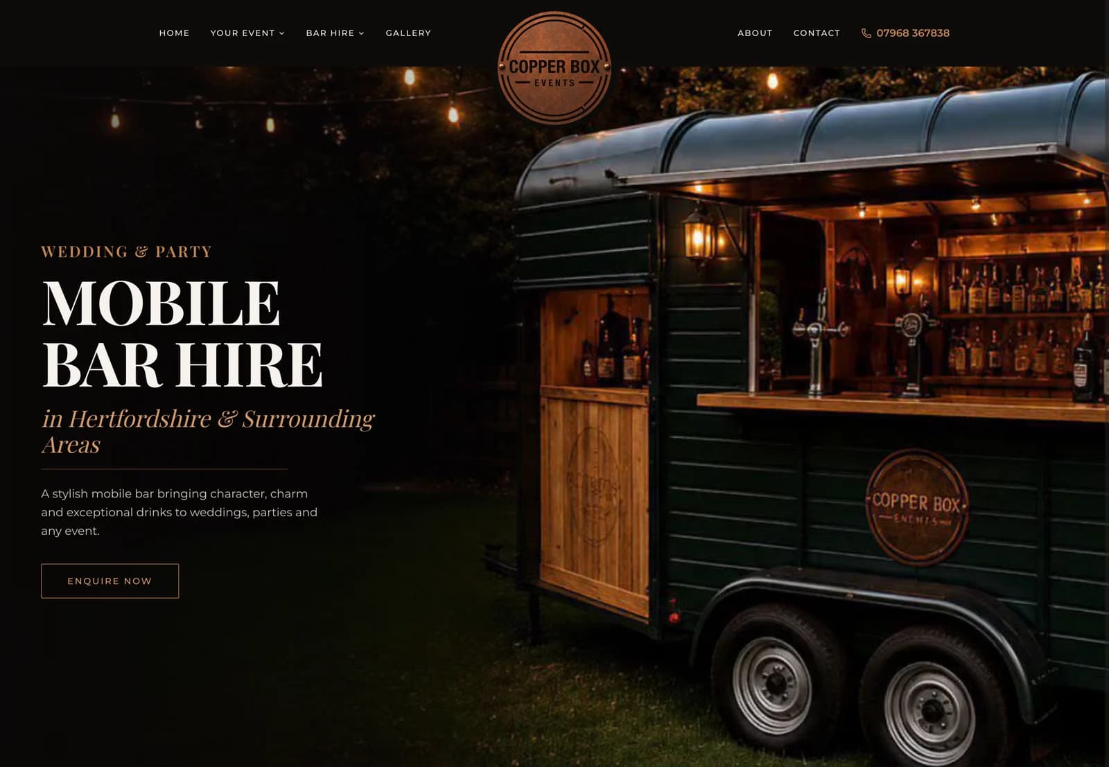
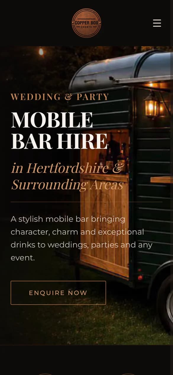
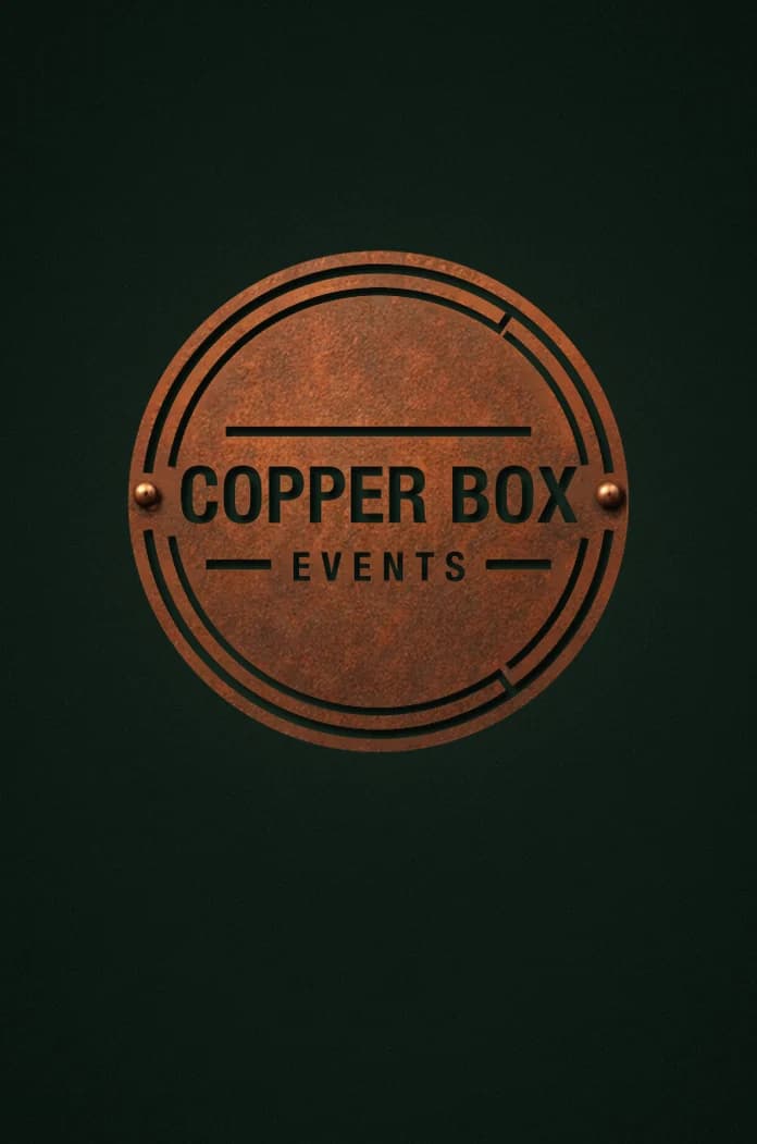
Three faces. One system.
Portrait, on dark stock, with a QR that had to survive both an icon in its middle and the printer's compression. Then the same system taken into a signature.
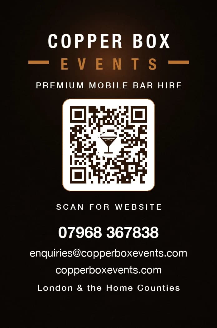
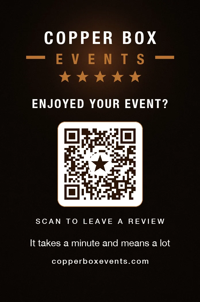
The review back is shown as a design preview and is not print artwork. Its QR points at the website, because the Google listing it should point at does not exist yet. A review card that sends people somewhere other than a review page is worse than no card, so it stays a preview until there is a real link to encode.
Copper, charcoal and cream.
Pulled from the patina in the original mark, so the palette and the logo came from the same place rather than being reconciled afterwards.
Charcoal
#0A0604
Vintage cream
#E6DED3
Copper
#B87333
Warm grey
#7A6F67
Deep brown
#3A2C25
Card stock
#0D1913
Display
Playfair Display, Bold
Mobile bar hire, done properly
Headings across the site.
Body
Montserrat, Regular
Weddings, parties and corporate events.
Running text. Crimson and Pinyon Script carry the accents.
- Card55 × 85mm portrait
- Logo masterSVG, prints to 34.7cm
- QRError correction H
- Site stackNext.js · Tailwind · Vercel
How it was actually put together.
- Dark because the trade is dark
- A horsebox bar works at dusk and after it, under strung lights. Building the site on a white page would have meant every image fighting its own surroundings, so the whole thing sits on charcoal and lets the warm light do the work.
- A QR code that was decode-tested, not eyeballed
- Generated at error-correction level H so it survives an icon sitting in the middle of it, with an espresso martini drawn as vector rather than dropped in as an image. Then decoded from the final compressed JPG, not from the pristine source, because that is the file the printer actually receives.
- Type doing the talking
- Playfair Display for the headlines, Crimson italic for the location line, Pinyon Script kept back for the one or two places a script earns its place. Self-hosted, so nothing waits on a font server before the page renders.
- Print and screen off one system
- The card and the site share a palette and a type scale. Nothing was redrawn per format, which is why the printed piece and the screen look like they came from the same studio rather than the same brief.
Credit where it is due
The Copper Box mark is the client's own, designed before we were involved. We did not design the identity. We rebuilt it as print-ready artwork, and the palette here is drawn from it.
The website, the business card and the hero imagery are ours. The hero is generated rather than photographed.